The Underrated Power of Finish and Texture in Home Design
- Amelia Roberts

- Dec 15, 2025
- 3 min read
Discover how finishes and textures elevate home design by adding depth, warmth, and character that transform ordinary spaces into refined interiors.

When people start planning a new kitchen or bathroom, most get caught up in the big stuff—layouts, sinks, those major statement pieces. But the difference between an ordinary renovation and a high-end, truly designer space? It’s all in the details: finishes and textures. These little choices shape the mood, mess with the light, and, honestly, decide how expensive your home feels.
Let’s look at three finish strategies that can turn a basic room into something that feels rich, layered, and really well thought out—plus, they make sure your choices look sharp and add real value.
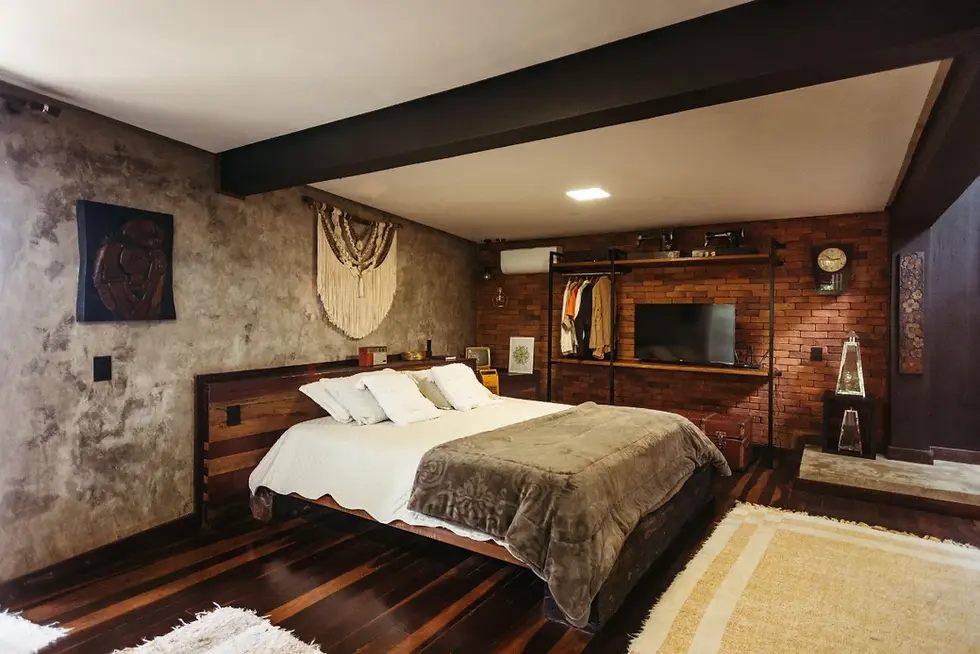
1. The Monochromatic Matte Look
Shiny chrome and that super-glossy finish? Not so much anymore. The top kitchens and bathrooms now lean into matte—think deep black, crisp white, or dark bronze. Matte finishes soak up light instead of bouncing it everywhere, so the whole space feels calm and grounded.
Bathrooms especially need this. You want that spa vibe? Matte is a must. Stick to it across every fixture—if you pick a matte black shower rail, match it to the hand towel ring and the faucet. In kitchens, try matte black handles on cabinets or a matte white sink, especially if you’ve got glossy counters. Matte finishes hide fingerprints and water marks way better, so things stay looking clean with less work. That’s a real selling point.
2. Playing with Texture
If everything’s smooth and flat, the room just feels cold—almost like no one lives there. You need contrast. The best way? Mix textured elements with sleek ones.
Pair things up: rough with smooth.
In the bathroom, if you’ve got big, glossy porcelain tiles on the wall, go for a floor tile with some grit or a stone finish. Add soft linen towels or a woven basket. The difference between a slick glass shower screen and a wooden vanity with some grain immediately makes the space feel more interesting.
In the kitchen, put smooth, plain quartz counters next to wood-grain cabinets or doors with deep grooves. These layers keep the room from feeling flat and make your eye travel around the space.
3. Metal Accent Finishes
If you want instant personality and a bit of warmth, metal accents are your friend. Chrome is safe, sure, but for real impact, warmer metals stand out.
Brushed Brass (or Gold): These work almost like a neutral, but with warmth. They look great with both light and dark colors. Use them on standout features—maybe the kitchen tap or vanity pulls. The brushed finish hides little scratches, so things look new for longer.
Brushed Nickel: This one’s cooler but still classy, great if you like a hint of industrial style. Brushed nickel pairs perfectly with gray tiles and stainless appliances.
The key here—don’t mix metals in the same room. Stick to one. If you’ve got brushed brass cabinet handles, don’t throw in polished chrome on the shower railing. Let one finish tie the whole space together, from taps to hardware.
When you get finishes and textures right, you move way past just making a room work. You build a space that feels good to touch, great to look at, and, honestly, adds real value when it comes time to sell.

Comments