The Speakeasy-Inspired Storage Mistake Most Home Bars Make
- Mia Turner

- Apr 1
- 7 min read
Learn the common speakeasy inspired storage mistake most home bars make and how smart organization can elevate style, convenience, and overall ambiance.

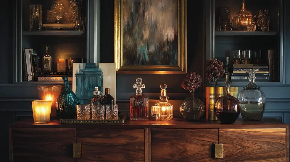
Walk into a well-designed speakeasy, even a modest one, and you feel it within seconds. The room has weight. Not heaviness exactly, but a kind of settled confidence, as if every element knows where it belongs. Most people credit this to the lighting, or the color palette, or the vintage glassware behind the bar. Those things help. But the real reason the room holds together is almost always a piece of furniture most home bar builders never think to include: a low, wide storage piece anchoring the longest wall.
It is the single most overlooked decision in home bar design, and it explains why so many otherwise well-intentioned setups end up looking assembled rather than designed. If you have ever stood back, looked at your home bar, and felt like something was off without being able to name it, there is a reasonable chance this is the gap. A well-chosen
A well-chosen modern buffet cabinet for the dining area does more structural work in a bar-adjacent room than most people expect, and understanding why changes how you plan the entire space.
Why Speakeasy Bars Always Feel Finished
The original speakeasies of the 1920s were not designed by interior architects. They were improvised rooms, often basements or back sections of legitimate businesses, built for function and discretion above everything else. And yet the aesthetic that came out of that era remains one of the most referenced in bar design today.
Part of the answer is the forced discipline of the space. Without unlimited budgets or purpose-built rooms, speakeasy designers had to make deliberate choices. Every piece of furniture earned its spot. What emerged, almost by necessity, was a layered approach to storage: open shelving for display, closed cabinetry for concealment, and one substantial grounding piece that gave the wall a visual base.
Wimberly Interiors, one of the most cited names in global hospitality design, has observed that the most enduring bar interiors succeed by creating a clear dialogue between statement pieces and intimate details, with each element doing defined work rather than competing for attention. In a home bar, the grounding piece is what makes that dialogue possible. Without it, the open shelves read as clutter and the bar cart reads as temporary.
The proportion logic matters here too. Interior designers working in commercial bar spaces typically follow a rough visual rule: no more than one-third of a bar wall should be open display, with the remaining area either closed storage or negative space. Most home bars invert this ratio entirely, stacking open shelves from floor to ceiling and wondering why the room never settles down.
The Storage Mistake Home Bar Builders Keep Making
The sequence usually goes like this. Someone decides they want a home bar. They buy a cart, a few bottles, some glassware. Then they add floating shelves. Then more shelves, a sign, maybe some vintage prints. Each addition feels like progress, and individually, none of it is wrong. The problem is cumulative. By the time the wall is full, there is no anchor, no closed storage, and no visual resting point anywhere. The eye has nowhere to land.
A few specific patterns come up again and again, and most of them are fixable without starting over.
No grounding piece is the most common. Floating shelves and bar carts sit visually in mid-air. Without a substantial low piece, the wall reads as a collection of objects rather than a composed vignette. Every well-designed bar room, from a corner speakeasy to a hotel lounge, has at least one piece that sits on the floor and carries real visual weight.
The absence of closed storage is the second problem. Open shelving looks intentional when it is edited, and chaotic when it is not. Home bars accumulate things: cocktail tools, extra napkins, bottles that do not photograph well, seasonal items. Without somewhere to put them out of sight, the display surface becomes overflow storage by default, and the whole wall suffers for it.
Mismatched heights create the third issue. A bar cart at 36 inches, floating shelves at 60 inches, and nothing occupying the visual space in between creates a gap the eye registers as incompleteness. A sideboard or buffet in the 32 to 36 inch range fills that mid-zone and connects the floor to the upper display area in a way nothing else does.
The last one is subtler: over-reliance on the bar cart. The cart is a wonderful accent piece. It is not a storage solution. Treating it as the primary furniture in a home bar is the equivalent of using a side table as your main seating. It works in a pinch. It does not work as a plan.
What the Furniture Is Actually Supposed to Do
A proper bar storage piece serves four distinct functions, and it is worth evaluating any candidate furniture against all four before committing.
The first is anchoring the visual weight of the wall. The piece should be wide enough and substantial enough to give the wall a base. As a practical benchmark, it should span at least half the width of the display area above it, or the display will always look like it is floating without support.
The second is providing closed storage for everything that should not be on display. Doors or drawers are not optional. They are what allow the open shelving above to stay curated rather than becoming a catch-all for whatever does not have a home.
Third, the surface of the piece becomes a secondary staging area: a tray with a candle and a decanter, a small plant, the glassware you reach for most often. This is where the room earns its finished quality, that sense of purposeful arrangement rather than gradual accumulation.
Fourth, and often underestimated: a substantial piece of furniture defines the bar zone without requiring a physical barrier. In open-plan homes especially, it tells the room, and the people in it, that this area has a specific purpose. Commercial speakeasies used back-bar furniture for exactly this reason, separating the bar zone from the lounge without walls or dividers.
Run your current setup against those four points. If even two are missing, the piece you have, or the absence of one, is almost certainly what is making the room feel unfinished.
How to Choose the Right Piece for Your Space
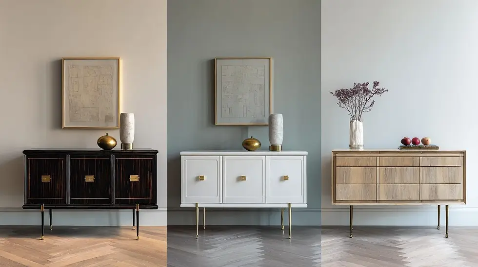
Scale comes first. A piece that is too small reads as an afterthought; too large and it crowds whatever breathing room the room has left. For most residential bar walls, something in the 60 to 72 inch width range anchors the space without overwhelming it. In smaller rooms, a 48-inch piece with strong visual presence, good legs, and a clean finish can do the same job at a tighter scale.
Height matters more than most people expect. Buffets and sideboards typically sit between 30 and 36 inches, which places the surface at a natural resting height and creates clear visual separation between the grounding piece and whatever shelving sits above it. A piece that is too tall starts competing with the shelving rather than supporting it, and the whole wall loses its hierarchy.
Finish and leg style should respond directly to the bar's aesthetic. For a speakeasy-leaning setup, darker stained wood with brass or black metal hardware reads as intentional and period-appropriate. For a more modern or industrial bar, a lacquered or cerused finish with slim tapered legs keeps the look from becoming heavy. Rustic setups benefit from natural wood with visible grain and unfussy hardware.
The trade-offs are real. Open shelving gives display flexibility but demands editorial discipline. Closed doors keep things clean but reduce the visual accessibility that makes a bar feel inviting rather than sealed off. Pieces combining open cubbies with closed drawers or cabinets tend to work best in home bars where the collection is still growing and the display has not yet been fully edited down. Leg height shifts the reading of the room too. A piece on taller legs feels lighter and more modern; a low piece sitting close to the floor reads as grounded and traditional. The choice should be deliberate.
For more on how the full speakeasy layout comes together from the wall back, the breakdown of speakeasy bar decor elements on Sip The Style covers the layering logic in useful detail.
Common Mistakes When Styling the Bar Cabinet Surface
Getting the right piece into the room is only half the work. The surface styling is where a lot of home bar setups lose the plot a second time.
Overcrowding is the most frequent error. The top of the buffet is a display surface, not additional storage. More than three to five objects and the surface starts working against the room rather than for it. The negative space around each object is what makes them readable individually, and what gives the overall arrangement its sense of calm authority.
Mixed metal finishes without a clear hierarchy create a related problem. Black hardware on the cabinet, brass candle holders, chrome cocktail tools, a silver ice bucket: each item might be attractive on its own, but without a deliberate finish logic, together they read as unresolved. Choosing one primary metal for the surface and allowing one accent finish for contrast is a simple rule that solves the problem entirely.
The sight line from seating is something most people never check. Surfaces get styled while standing over them, and then everyone sits down and the vignette disappears, or a bottle blocks the candle, or the decanter reads as part of the wall rather than an object in front of it. Style from a seated position, or at minimum check the arrangement from that angle before considering it done.
One last thing worth naming: the surface should be the last thing populated, not the first. Bottles and tools should come after the decorative objects are placed, fitting around the display logic rather than claiming every inch before the styling even starts.
I've found that the setups holding up best over time are the ones where the furniture decision came before everything else. Not the glassware, not the cart, not the shelves. The room builds correctly from that one foundation piece, and everything else slots into a space that already knows what it is doing.
The speakeasy designers who built those enduring rooms did not have much to work with. What they had was clarity about which piece of furniture was carrying the room, and the discipline to choose it before anything else went on the walls. That part of the formula, for what it's worth, has not changed.
For reference on how wet bar placement and plumbing interact with the storage layout you are planning, the wet bar sink ideas guide on Sip The Style is worth reading before the furniture plan gets finalized.


Comments