Restroom Signs in Public Buildings: Designing for Clarity, Accessibility, and Inclusion
- Zayden Frost

- Jun 1
- 3 min read
Learn how restroom signs in public buildings can improve clarity, accessibility, and inclusion while helping visitors navigate spaces with confidence.
Restroom signs are wayfinding elements used to identify restroom locations and provide accessible information for users in public and commercial buildings.
Restroom location is the second most common question asked at information desks in hospitals, airports, and large commercial buildings — right behind directions to a specific department. For something so universally needed, restroom signage is remarkably easy to get wrong. And when it fails, the frustration is immediate in a way that other wayfinding problems rarely provoke.
The challenge has grown more complex recently. Stricter accessibility standards, evolving expectations around gender-inclusive design, and a broader push toward universal design principles have added new layers to what was once a simple pictogram-on-a-door problem.
The Two-Stage Problem in Restroom Signage
Most buildings only place a sign on the restroom door itself. This means visitors must already know where the restroom is to find it — which defeats the purpose of signage entirely.
Effective restroom wayfinding requires two types of signs working together:
directional signs — placed at decision points such as corridor intersections, elevator lobbies, and floor landings to guide visitors toward the restroom before they can see it
identification signs — placed at the restroom door to confirm the location, provide accessibility information, and identify the facility type
Directional restroom signs should appear at every point where a visitor might reasonably turn the wrong way. The sign doesn't need to be large — a small, consistently formatted directional marker at each decision point is far more effective than a single large sign at the restroom door.
ADA Requirements: More Than a Checkbox
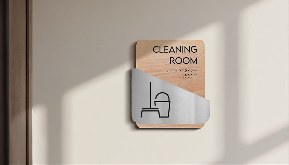
Restroom signs in ADA-regulated environments must include tactile raised characters, Grade 2 Braille, non-glare finishes, and specific mounting on the latch side of the door at 60 inches to center. The pictograms must meet minimum size requirements and maintain sufficient contrast with the background.
Restroom signs by BSign Store are designed for public and commercial buildings with these requirements integrated from the design stage — avoiding the common problem of retrofitting accessibility onto signs that were specified without it.
But ADA compliance is a floor, not a ceiling. Universal design principles push further: high-contrast color combinations help visitors with low vision, simple geometric pictograms work for non-native language speakers, and consistent placement conventions reduce cognitive load for everyone navigating an unfamiliar building. The best restroom signage serves the widest possible range of users, not just the minimum required by regulation.
The Gender-Inclusive Signage Question
The increasing adoption of all-gender restrooms has introduced genuine design challenges. Traditional male/female pictograms don't apply, and there's no universal standard for alternatives. Approaches range from text-only signs ("Restroom" or "All-Gender Restroom") to modified pictograms to purely functional descriptions ("Restroom with Urinal", "Restroom with Stall Only").
The design challenge is clarity without ambiguity. In buildings where gendered and all-gender restrooms coexist on the same floor, the signage system needs to differentiate options without implying that one is the default and others are exceptions. Whatever convention a building adopts, it should be applied uniformly — mixed approaches between floors create exactly the confusion that signage is supposed to eliminate.
What Effective Restroom Signage Looks Like in Practice
The buildings that get this right share a few traits. Their restroom signs are visible from corridor distance, not just from directly in front of the door. The directional signs use the same visual language as the door signs, so visitors recognize them as part of a connected system. Accessibility features are integrated into the design rather than appended. And the signage is maintained — no peeling adhesive, no faded pictograms, no handwritten "Out of Order" notes on printer paper.


Comments