
15 Chalk Paint Coffee Table Ideas for Stunning Makeovers

Discover 15 chalk paint coffee table ideas for stunning makeovers that transform tired furniture into gorgeous, vintage-inspired centerpieces.

Chalk paint transforms tired, scratched, outdated coffee tables into gorgeous, matte-finished, vintage-inspired centerpieces without the tedious sanding, priming, and multi-coat preparation that traditional paint demands before a single brushstroke touches the surface, making it the ultimate lazy perfectionist's dream medium where beautiful results arrive faster and easier than any other furniture refinishing method available to DIY enthusiasts working with limited time and even more limited patience. Have you ever stared at your scuffed, ring-stained coffee table and imagined how stunning it could look with a fresh, velvety matte finish that hides every flaw beneath one transformative coat? Chalk paint makes that transformation happen in a single afternoon. Think of chalk paint like makeup for furniture, where matte magic covers imperfections beautifully. Let's explore fifteen ideas.
1. Classic White Distressed Finish
A classic white distressed finish coats your coffee table in pure white chalk paint, then strategically sands the edges, corners, and high-contact areas to reveal the original wood beneath, creating the timeless, farmhouse-inspired, looks-like-it-lived-in-grandma's-parlor-for-decades aesthetic that brand-new, factory-fresh, pristine furniture never carries through its unblemished, zero-history, personality-free, straight-from-the-showroom surface presentation. Apply two coats of white chalk paint, allowing full drying between layers, since the built-up opacity provides the solid coverage that single coats sometimes miss on darker underlying surfaces. Sand edges and raised details with medium-grit sandpaper, because the selective removal reveals original wood tones beneath the white for authentic, time-worn beauty. Seal with clear wax. Think of white distressing like aging gracefully on fast-forward. Your table gains instant vintage charm.

2. Two-Tone Contrast Design
A two-tone contrast design paints the table top one color and the base, legs, or apron another, creating visual interest through deliberate color separation that monochromatic, single-color treatments cannot deliver through their uniform, same-tone-everywhere finish lacking the designed, intentional, this-was-a-choice distinction that contrasting tones communicate through their visible, obviously deliberate, impossible-to-mistake-for-accident color boundary between upper and lower table sections. Choose a dark top with light legs, or reverse the combination, since both configurations create striking visual separation between surface and structure. Paint the body in one chalk paint color, tape the dividing line carefully, then apply the contrasting second color to the remaining sections for clean edges. Distress both colors at edges. Seal with coordinating wax. Think of two-tone like coffee tables wearing color-blocked outfits. Your makeover designs intentionally.

3. Ombre Gradient Effect
An ombre gradient effect blends chalk paint from dark at one end through progressively lighter tones toward the other, creating the smooth, flowing, sunset-like color transition that flat, single-shade finishes deliver uniformly but ombre treatments amplify dramatically through their visible, directional, gradually changing tonal progression across the table's surface for artistic, eye-catching, definitely-not-basic visual impact that every guest notices and comments on immediately. Mix three to four tones of one color family, from deep saturation through light pastel, since the tonal range determines the gradient's visual drama from subtle through extreme. Apply each shade in sequential sections, then blend the overlapping edges while the paint remains wet using a dry brush or sponge. Seal after complete drying. Think of ombre like painted sunsets on furniture. Your table transitions beautifully.

4. Stenciled Pattern Top
A stenciled pattern top applies decorative designs directly onto your chalk-painted coffee table surface, where the layered paint creates intricate, mandala, damask, or geometric patterns that look like professional hand-painting or expensive imported tilework but actually cost nothing beyond a reusable stencil and a contrasting chalk paint color applied through the cut openings with a dry, dabbing brush technique preventing the bleeding that wet, overloaded brushwork causes beneath stencil edges during enthusiastic but technique-poor application attempts. Paint the table base color first, let it cure completely, then position the stencil and apply the contrasting color using a stencil brush or sponge, since the dry-dabbing technique produces the crispest, bleed-free pattern edges. Choose large-scale stencils for dramatic impact. Seal the finished design. Think of stenciled tops like printed fabric applied through paint. Your surface gains intricate pattern.

5. Color-Washed Weathered Look
A color-washed weathered look dilutes chalk paint with water, then applies the thinned mixture over your table's natural or previously stained wood, creating a translucent, sun-faded, beach-weathered appearance where the wood grain shows through the sheer color layer like looking at the surface through tinted glass rather than the opaque, grain-hiding, full-coverage coating that standard, undiluted chalk paint application produces through its thick, everything-beneath-disappears, solid-color finishing technique covering every original detail completely. Mix chalk paint with water at a ratio of one part paint to two parts water, since the thinned consistency creates the translucent, wood-revealing wash that heavier mixtures hide through their increased opacity approaching full coverage. Brush the wash along the grain direction. Wipe excess with a rag. Seal with matte wax. Think of color washes like watercolor techniques for furniture. Your wood whispers through color.

6. Bold Black Matte Finish
A bold black matte finish coats your coffee table in deep, dramatic, light-absorbing black chalk paint, creating the statement-making, modern, confidently bold centerpiece that lighter, safer, play-it-neutral color choices cannot deliver through their cautious, blend-into-the-background, offend-nobody approach to furniture refinishing lacking the unapologetic, room-commanding, impossible-to-ignore visual authority that a solid black, perfectly matte, velvety-to-the-touch chalk paint finish projects across every living room it occupies with its dark, distinguished, conversation-starting presence. Apply two to three coats of black chalk paint for solid, streak-free coverage, since black reveals brush marks and thin spots more obviously than lighter colors show through their forgiving, imperfection-hiding brightness. Sand edges very lightly for subtle distressing. Seal with clear wax for protection. Think of black matte like tuxedos for your coffee table. Your furniture commands the room.

7. Coastal Blue Aged Finish
A coastal blue aged finish wraps your coffee table in soft, ocean-inspired chalk paint tones that channel the sun-faded, salt-air-weathered, beach-cottage aesthetic where furniture looks like it spent decades beside an open window overlooking the shoreline rather than sitting inside a suburban living room that never once experienced the actual coastal weathering the finish convincingly mimics through its distressed, layered, deliberately worn-looking surface treatment. Choose soft blue, pale aqua, or dusty teal chalk paint, since these coastal tones produce the beach-house warmth that darker, more saturated blues miss through their intense, navy-adjacent, serious-rather-than-breezy visual energy. Distress heavily at edges and corners. Sand through to reveal warm wood tones beneath. Apply white wax for a faded, sun-bleached effect. Think of coastal blue like ocean breezes painted onto furniture. Your table channels the shore.

8. Layered Multi-Color Distress
Layered multi-color distressing applies several chalk paint colors in sequential coats, then sands through the layers at various depths, revealing different colors at different spots for the complex, genuinely aged, looks-like-it-was-painted-and-repainted-over-a-hundred-years surface that single-color distressing cannot produce through its limited, one-color-over-one-color, two-dimensional depth lacking the rich, archaeological, paint-history-revealing complexity that multi-layer techniques deliver through their three-or-more-color depth creating visible stratigraphy across every sanded surface. Paint the first coat, let it dry, then apply a second contrasting color, then a third final coat, since the three-layer sequence provides the depth that becomes visible during sanding when different pressure levels reveal different underlying colors. Sand edges and surfaces unevenly. Seal with clear wax. Think of layered distressing like revealing furniture archaeology. Your table shows beautiful depth.

9. Metallic Wax Highlight
Metallic wax highlight applies shimmering gold, silver, copper, or bronze wax over dried chalk paint, creating subtle, light-catching shimmer that adds luxurious dimension to the matte surface without overwhelming the chalky texture that defines the medium's signature aesthetic, where the metallic accent enhances rather than replaces the velvety base coat with carefully controlled sparkle applied to raised details, edges, and strategic surfaces catching ambient light throughout the room's varied illumination conditions between morning and evening. Apply metallic wax using a lint-free cloth or small brush over fully dried and waxed chalk paint, since the metallic layer bonds best to sealed surfaces where the base wax provides the tacky foundation that metallic particles adhere to during application. Highlight raised carvings and edges. Buff gently. Think of metallic wax like jewelry highlights for furniture. Your table shimmers subtly.

10. Farmhouse Sage Green
Farmhouse sage green chalk paint wraps your coffee table in the muted, herb-garden-inspired tone that channels country kitchen warmth through its earthy, organic, nature-derived color association connecting interior furniture to the outdoor gardens, herb beds, and pastoral landscapes that farmhouse design philosophy celebrates through its gentle, earth-respecting, natural-material-loving aesthetic approach to comfortable, lived-in, family-gathered home environments where tables show wear proudly rather than hiding it beneath pristine, untouched, museum-quality perfection. Apply two coats of sage green chalk paint, since the soft, grey-green tone produces the mature, sophisticated, grown-up alternative to bright greens that read as juvenile or seasonal rather than timelessly appropriate across all months and all living room styles. Distress lightly at edges. Seal with clear or dark wax. Think of sage green like garden herbs translated to furniture. Your table grows with earthy warmth.

11. Decoupage and Chalk Paint Combo
A decoupage and chalk paint combo applies decorative paper, fabric, or napkin designs onto your chalk-painted table surface, creating the artistic, mixed-media, one-of-a-kind finish that paint alone delivers in solid colors but decoupage elevates through the printed imagery, patterns, and textures that glued-on decorative materials introduce across the table's most prominent surface for genuinely unique, conversation-starting, nobody-else-has-this visual personality. Paint the table in a base chalk paint color, let it cure, then apply decoupage medium to adhere chosen paper or fabric designs onto the top surface, since the bonded material creates a permanent, sealed, protected decorative layer. Choose botanical prints, vintage maps, or patterned napkins. Seal with multiple coats of decoupage medium or polyurethane. Think of decoupage like collage art applied to furniture. Your table wears mixed-media beauty.

12. Geometric Painted Design
A geometric painted design uses painter's tape to create clean-edged triangles, diamonds, stripes, or chevron patterns across your chalk-painted coffee table surface, where the structured, intentional, precisely taped design communicates modern, graphic, design-conscious styling that freehand painting approximates loosely but tape-defined geometry delivers with the crisp, professional, looks-like-a-designer-did-it precision that clean lines require for convincing, confidence-inspiring, ready-for-Instagram visual results across the table's most photographed, most viewed, most design-critical flat surface. Paint the base color first, let it cure completely, then apply painter's tape in your chosen geometric pattern before applying the contrasting color over the exposed sections, since the tape prevents color bleeding for sharp, clean transitions between tones. Remove tape before the second color dries completely. Seal with wax or polyurethane. Think of geometric designs like modern art painted on furniture. Your table angles sharply.

13. Dry Brush Texture Technique
A dry brush texture technique loads minimal paint onto a nearly dry brush, then drags the bristles across your coffee table surface creating streaked, textured, deliberately imperfect brushwork that builds layered, weathered visual complexity through the visible, stroke-showing, hand-applied texture that smooth, full-loaded brushwork hides beneath its solid, opaque, texture-free coverage concealing the human hand's involvement behind a manufactured-looking, personality-free, machine-applied finish appearance rather than celebrating the handmade, visible-brushwork, I-did-this-myself character that dry brush techniques proudly display across every intentionally imperfect painted stroke. Dip the brush in paint, then wipe most of it off onto a paper towel before dragging across the surface, since the starved brush deposits paint only on raised surfaces while skipping recessed areas for varied, textured, dimensional appearance. Layer multiple dry-brush passes. Seal with clear wax. Think of dry brushing like painting with whispers. Your table gains handmade texture.

14. Antiqued Dark Wax Finish
An antiqued dark wax finish applies tinted protective wax over dried chalk paint, settling dark pigment into crevices, grain patterns, and molding details to create the aged, time-darkened, genuinely old-looking patina that fresh, clean, evenly colored chalk paint cannot deliver through its uniform, shadow-free, every-spot-looks-the-same coverage lacking the darkened recesses, highlighted raised surfaces, and naturally aged tonal variation that dark wax introduces through its pigment-loaded formula pooling in low spots while wiping cleanly from high surfaces for dimensional, convincingly antique visual results. Apply clear wax first as a base, then follow with dark wax using a brush or cloth, since the clear layer provides the controlled absorption surface that prevents dark wax from staining unevenly on raw chalk paint. Buff excess. Work in sections. Think of dark wax like instant aging serum for furniture. Your table ages convincingly.

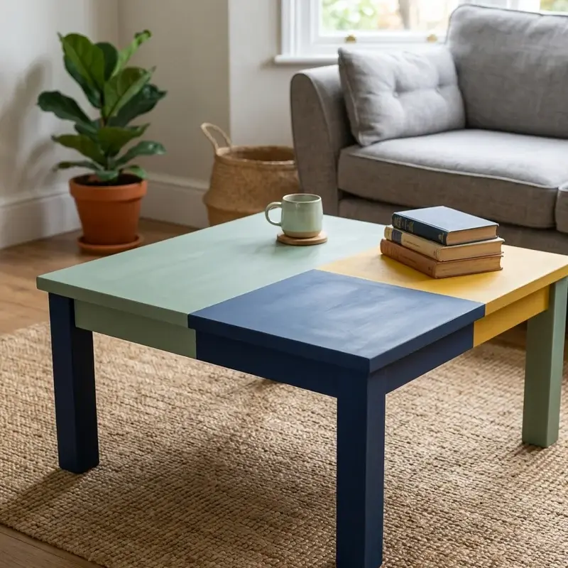
15. Color-Blocked Modern Design
A color-blocked modern design divides your coffee table surface into bold, geometric sections painted in contrasting chalk paint colors, creating the contemporary, graphic, design-forward finish that traditional, single-color, uniformly painted furniture delivers predictably but color-blocked alternatives amplify dramatically through their intentional, visible, look-at-me color divisions communicating modern, art-influenced, deliberately styled visual confidence across every divided, contrasting, sharply separated painted section covering the table's most visible surfaces. Plan your color-block layout, then tape clean dividing lines across the table surface before painting each section in a different chalk paint color, since the varied tones create the modern, graphic impact that single-color treatments miss through their uniform, division-free, conventional application. Choose two to three complementary colors. Remove tape carefully. Seal with clear wax or matte polyurethane. Think of color blocking like modern art painted onto your table. Your furniture designs boldly.
Conclusion
Chalk paint coffee table makeovers prove that tired, scratched, outdated furniture transforms into gorgeous, vintage-inspired, personality-filled centerpieces when this forgiving, no-prep-needed medium meets creative vision and a free afternoon of satisfying, hands-on DIY painting that anyone with a brush and a can of chalk paint accomplishes without professional experience or expensive equipment. These fifteen ideas span classic white distressing to modern color blocking, matching every skill level and style preference. Whether you stencil intricate patterns or apply dark antiquing wax, chalk paint delivers stunning results every time. Start your coffee table makeover today.
FAQs
Q1: Do I need to sand before using chalk paint?
A: No, chalk paint adheres to most surfaces without sanding, though light scuffing helps on very glossy finishes.
Q2: How many coats of chalk paint does a coffee table need?
A: Two coats provide solid coverage for most colors, though darker shades may need three for complete opacity.
Q3: Should I seal chalk paint on a coffee table?
A: Always, since unsealed chalk paint scratches and stains easily on high-use surfaces like coffee tables requiring daily protection.
Q4: What sealer works best over chalk paint?
A: Wax provides a traditional matte finish, while polyurethane delivers more durable, water-resistant protection for heavy-use surfaces.
Q5: How long does a chalk paint coffee table makeover last?
A: Properly sealed chalk paint finishes last three to five years on coffee tables with normal daily household use.


Comments